The 8 Elements of Modern Web Design & Web Design Trends to Watch
Every year, we see new elements and styles in website design begin to emerge.
Some elements -- when incorporated thoughtfully -- help tell stories and explain your company. Other elements work to improve how content looks on a specific device. While it's not necessary to include every trend that comes about on your website, many of them have the potential to improve your visitor's experience.
But with so many options to choose from, it can be challenging to determine which ones are really worth considering. To help you narrow your focus, we've detailed eight important elements of modern website design that you can include to improve your site's performance.
8 Modern Website Design Elements and Trends
Element #1: Unique and Large Typography
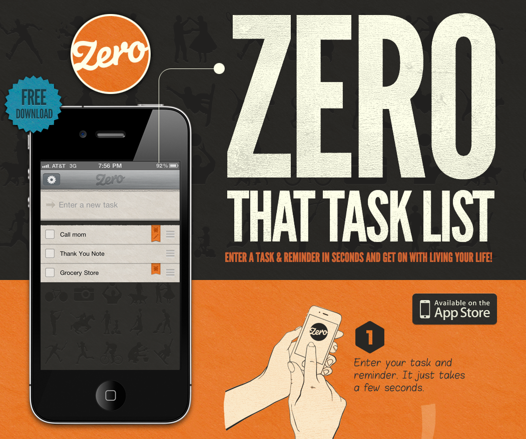
Most companies have a particular font or typography that they use to help their customers immediately identify them versus their competitors. In recent years, designers have received a larger selection of fonts to choose from, making it easier for brands to more accurately express themselves through typography.For example, The New Yorker is recognized instantly through their use of unique font, Adobe Caslon Pro. While more unique fonts, such as Blokletters-Balpen, have begun to be used by startups and technology companies like Zero.
Why is it useful?
Typography uses one design trend across the website to lead readers to different parts of the page. For instance, The New Yorker website leads visitors from one section to another based on the typography and font sizes.When creating your company's brand, your choice in typography can indicate subtle hints about who you are. Are you fun or serious? Functional or informational? Regardless of what font you choose, be sure that your designer considers its applicability across browsers and computers. Choosing a font that is not supported by common browsers and computers could mean that your website displays awkwardly on different devices.
Element #2: Large & Responsive Hero Images
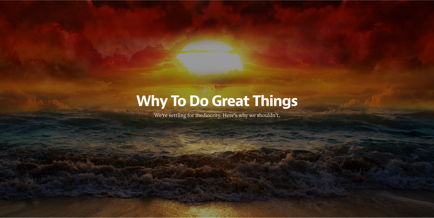
Large images such as this one do away with the concept of above and below the fold. By focusing on just the image with text rather than a CTA or social buttons, Medium creates a strong visual experience that encourages you to scroll down to read more.
Large hero images are also often placed in the background with text and other content overlaid on top, like on Uber's website. Regardless of the approach you utilize, large images can help visually tell your story without having to rely on just text.
Why is it useful?
That said, ensuring your images are responsive makes for a good user experience. Small business website visitors can look at different images -- whether they are the background or product images -- and be able to get the same experience no matter what device they are coming from.
Element #3: Background Videos
Let's take Wistia's website, for example. When you land on their homepage a large video automatically starts playing in the background, and by clicking on the play button, you get a deeper look at Wistia:

Why is it useful?
In addition, video is processed 60,000 times faster by our brains compared to text. While people are often hesitant to read heavy blocks of text, videos appear effortless and can be consumed very quickly. It also helps that connection speeds are increasing and mobile device sizes are growing, making for better video experiences.
Element #4: Semi-Flat Design
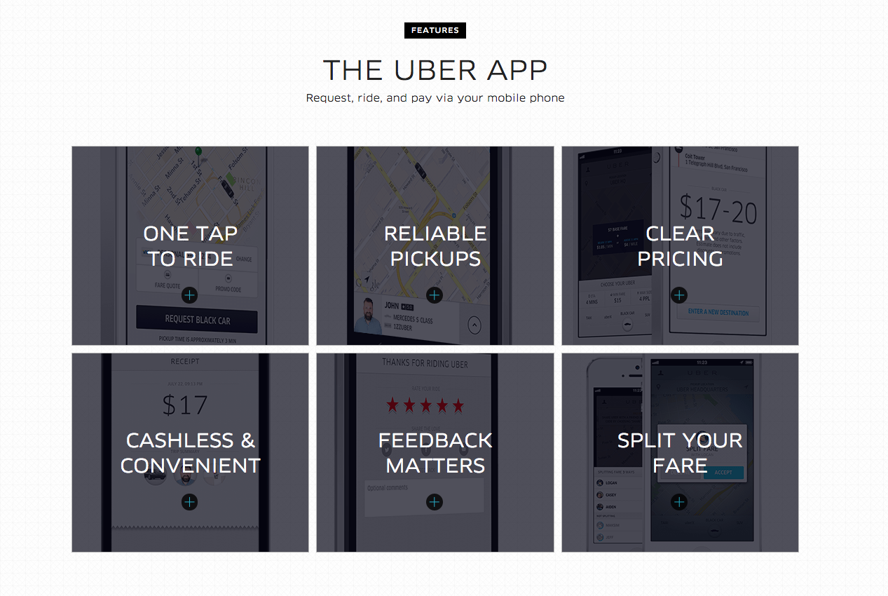
Following in Apple's footsteps, many other organizations -- both large and small -- have shifted to flat design. However, company's like Uber have put their own spin on the style by adding subtle shadows and dimensions. As you can see in the image below, the boxes have an element of depth with shadows around them, without overdoing it:
Why is it useful?
Element #5: Hamburger Menus
The hidden, or hamburger, menu changes this. This menu was common in web applications before making it's way to web design -- even in Google Chrome you can find a hamburger menu on the right-hand side.
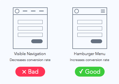 Source: UX movement
If you use your imagination, the three lines that are stacked on top of one another look like hamburger patties. Get it?
Why is it useful?
Element #6: Giant Product Images
To give you a better idea of what we're talking about, let's take a look at the product page for the HubSpot Website Platform:
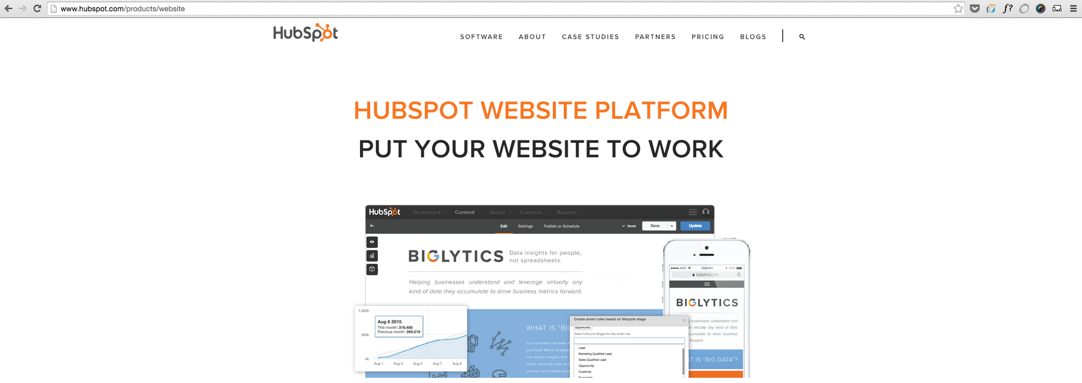
There is a large featured image at the top of this page, and as you scroll down the page there are additional in-depth product images. The images are also responsive which aims to ensure an optimized experience for viewers coming from different devices, as we mentioned earlier.
Why is it useful?
This approach reinforces the benefits of a feature by providing the opportunity to highlight the most valuable pieces. For instance, in the second image, you will notice that there are numbers on the image corresponding with benefits of certain features.
These large images are also scan-friendly. They help visitors generate a solid understanding of what the different product features do by convey them through images instead of words.
Element #7: Card Design
Brit + Co's homepage serves as a great example of card design in action:
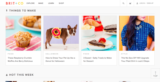
By breaking up different pieces of content into cards, users can pick and choose which articles they want to expand. This helps to keep the homepage feeling clean and organized, without relying on a ton of text.
Why is it useful?
Keep in mind that your cards should be responsive. This means that as the screen size gets smaller or larger, the number and size of cards shown should adapt accordingly.
Element #8: Short Product or Feature Videos
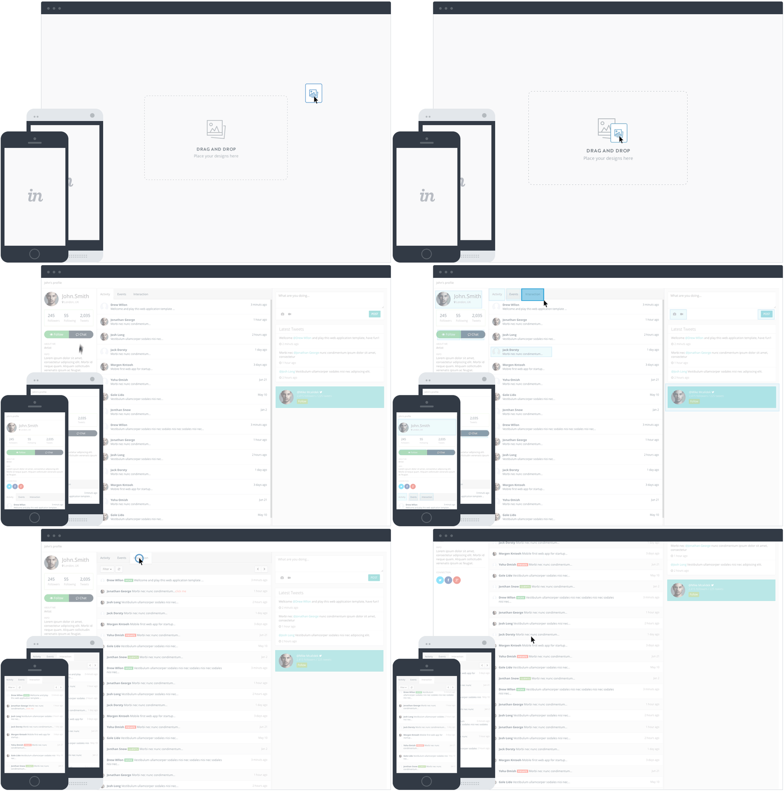
A strong example of this comes from the folks at InVision. They display this short illustrator of how easy it is to use their product by dragging-and-dropping a design directly on their homepage:
Why is it useful?
These short videos allow for your prospect to quickly understand value without watching a really long, in-depth experience. Sure, both have value, but the shorter videos allows for quick understanding that is best for top of the funnel.
Shared by Webtady
See The Original Post


0 comments:
Post a Comment